Understanding the basic CSS
text properties , float, display and many more............


So let's begin with the css which we need to learn before the topics like : flex-box, grid and responsive etc.
CSS Text Properties
Here we are talking about all the css properties that help us to change the appearance of any text rendered on our web page .
CSS text formatting properties is used to format text and style text.
CSS text formatting include following properties:
1. Text-color :
Text-color property is used to set the color of the text.
Text-color can be set by using the name “red”, hex value “#ff0000” or by its RGB value“rgb(255, 0, 0).
Syntax:
body
{
color : yellow;
}
2. Text-alignment :
Text alignment property is used to set the horizontal alignment of the text.
The text can be set to left, right, centered and justified alignment.
In justified alignment, line is stretched such that left and right margins are straight.
Syntax:
body
{
text-align : center ;
}
3. Text-decoration :
Text decoration is used to add or remove decorations from the text.
Text decoration can be underline, overline, line-through or none.
Syntax:
body
{
text-decoration : none ;
}
4. Text-transformation :
Text transformation property is used to change the case of text, uppercase or lowercase.
Text transformation can be uppercase, lowercase or capitalise.
Capitalise is used to change the first letter of each word to uppercase.
Syntax:
body
{
text-transform:type;
}
5. Letter spacing :
This property is used to specify the space between the characters of the text. The size can be given in px.
Syntax:
body
{
letter-spacing:size;
}
6. Text-direction :
Text direction property is used to set the direction of the text.
The direction can be set by using rtl : right to left .
Left to right is the default direction of the text.
Syntax:
body
{
direction : rtl ;
}
7. Text-shadow :
Text shadow property is used to add shadow to the text.
You can specify the horizontal size, vertical size and shadow color for the text.
Size is given in px .
example : 3px 1px blue
Syntax :
body
{
text-shadow:3px 1px blue;
}
8. Word spacing :
Word spacing is used to specify the space between the words of the line. The size can be given in px.
Syntax:
body
{
word-spacing : 2px ;
}
Background :
CSS background property is used to define the background effects on element. There are 5 CSS background properties that affects the HTML elements.
The background property is a shorthand property for:
1.Background-color :
The background-color property is used to specify the background color of the element.
You can set the background color like this: p{ background-color : #b0d4de ; }
2.Background-image :
The background-image property is used to set an image as a background of an element.
By default the image covers the entire element.
example :
body {
background-image : url("paper1.gif") ;
margin-left : 100px ;
}
3.Background-position :
The background-position property is used to define the initial position of the background image. By default, the background image is placed on the top-left of the webpage.
You can set the following positions:
- center
- top
- bottom
- left
- right
Example :
background -image : url(''good-morning.jpg'');
background-repeat: no-repeat;
background-attachment: fixed;
background-position: center;
4.Background-repeat :
By default, the background-image property repeats the background image horizontally and vertically.
Some images are repeated only horizontally or vertically.
we can set values as repeat-x , repeat-y or no-repeat.
example :
background -image : url(''good-morning.jpg'');
background-repeat: no-repeat;
5.Background-attachment :
The background-attachment property is used to specify that the background image is fixed or scroll with the rest of the page in the browser window.
This property has three values scroll, fixed, and local.
syntax :
background-attachment: scroll | fixed | local | initial | inherit ;
Property Values
scroll : It is the default value that prevents the element from scrolling with the contents, but scrolls with the page.
fixed : Using this value, the background image doesn't move with the element, even the element has a scrolling mechanism. It causes the image to be locked in one place, even the rest of the document scrolls.
local : Using this value, if the element has a scrolling mechanism, the background image scrolls with the content of the element.
initial : It sets the property to its default value.
inherit : It inherits the property from its parent element.
Box Model :
The CSS box model is used to define the design and layout of the elements of CSS
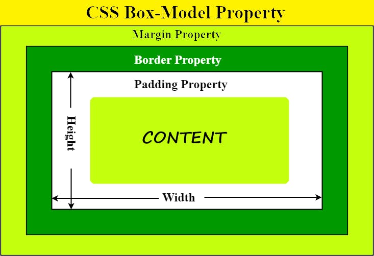
The elements are as follows :
Content : This area consists of content like text, images, or other media content.
Padding : . This area is actually the space around the content area and inside the border-box. Its values are given in pixels. example :
padding : 5px ;Border : It is the area between the box’s padding and margin. Its dimensions are given by the width and height of the border. example :
border : 2px solid black ;Margin : This area consists of space between border and margin. The dimensions of the Margin area are the margin-box width and the margin-box height. It is useful to separate the element from its neighbors. example :
margin : 5px ;
Float :
Float is a positioning property that places an element to the left side or right side of its container and allows inline elements to wrap around it.
To use float in CSS, you only need a CSS selector and the defined float property inside the brackets.
So the syntax would look something like : element { float: value; }
How do you float an image in CSS ?
img { float: right; }
without Float property 🙁🙁
after using Float : Right 😃😃
Display properties :
The display property takes many different values such as inline, inline-block, block, table
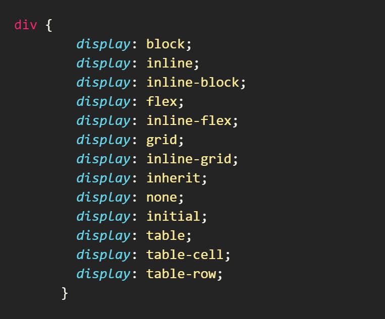
1. Display: inline
An element with a display property set to inline will not start on a new line and it will take up the remaining/available screen width. It just takes up the space such an element would normally take.
Because of this, you can't set the width and height of an element that has a display of inline, becuase it does not take up the whole screen width.
Some elements are inline by default, like <span>, <a>, <i>, and <img>
2. Display: block
the element that has display property as block starts on a new line and takes up the available screen width.
You can specify the width and height properties for such elements.
Examples of elements that are at block-level by default are <div>, <section>, <p> and lots more.
You can set the span to block display and it will behave like a block-level element.
3. display : inline-block
When you assign a display of inline-block the presentation will be like inline. But it has the added advantage of you being able to apply width and height to it, which you can't do when the element is assigned a display of inline.
So, you can look at the inline-block display as an inline element and block element in one package.
4. Display : None
When you set the display property of an element to none, the element is completely taken off the page and it doesn’t have an effect on the layout.
This also means that devices like screen readers, which make websites accessible to blind people, wont't have access to the element.
Do not confuse display: none with visibility: hidden. The latter also hides the element, but leaves the space it would normally take open or empty.